The studio garden is alive with color this week so I’ve been spending time outside each morning listening for the muses…
I had photographed this butterfly yesterday as she drank in the nectar from Pat’s Zinnia bed…and so today I brought out a teacup and set it on the split rail fence…and waited…and waited…for the sun to climb over the tree tops and reach that same raking angle.
Pat came out and found me sitting and staring at the fence and decided it would be a good time to pick some of her flowers…
Herself never looks lovelier than when she is holding a handful of her beloved Zinnias.
Just after she left the sun came through and I captured the shadows through the petals and the fleeting light. As I turned to leave, yesterday’s butterfly came back and danced across the tops of the remaining flowers. I was sad to see that a large chunk of her delicate wings had been broken off.
So my visit with her yesterday, in all her cathedral-winged glory, was arranged by the muses after all…and, like so many of these Garden Graces Series paintings, the emphasis is on…grace.
It was a wonderful opening at the Granary Gallery last week and, though we are home, and I’m already back at work starting on the next year’s worth of paintings, the show will hang for the rest of the summer and the gallery staff reports that visitors are spending a lot of time studying those details…
If I did this right, this should post all by itself on the morning of the Granary Gallery Show opening. And if all else goes well, Pat and I will be waking up to a beautiful day on the Vineyard as you read this.
As I am writing this tonight it is almost midnight and we are still a week away from leaving home, the studio is full of carefully wrapped paintings, the trailer has yet to be cleaned out, and there is much packing yet to do…so you can imagine that this new technology is playing little tricks on my weary psyche.
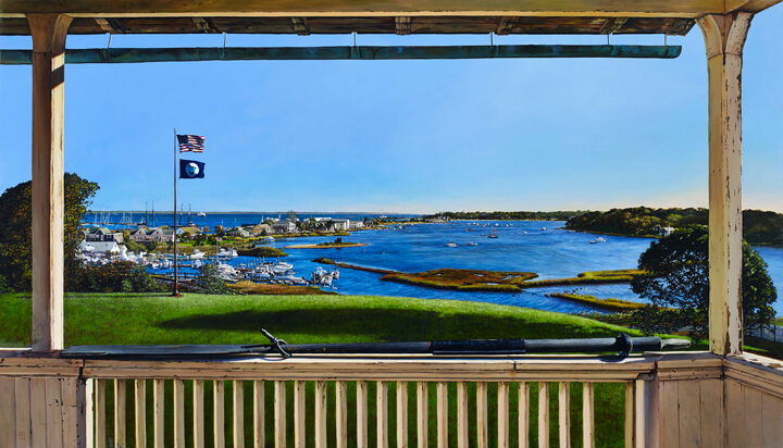
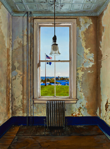
It has been a long and rewarding journey to make my creative way through this series, Reclamation. And without further ado, I give you it’s finale…
Severe Clear – 40″ x 70″
My guide at the beginning of this journey was Denys Wortman, a MV Museum Board member whose Vineyard roots are deeply woven into the fabric of the island, Denny was a fountain of information.
I returned to the building many times during that visit last autumn and tried to experience how the light and shadows changed over the course of a day. One morning Denny met me and brought along the museum flag. When I stepped outside to walk across the wide expanse of front lawn to help him raise it I commented on how there wasn’t a cloud in the crisp October sky. “Pilots call that Severe Clear”, he replied.
Back in my Pennsylvania studio when I was looking through the sketches and notes I had taken I found that I had written down that phrase and, for almost every morning of the dozens of days it took me to paint this view from the balcony, the spring sky here was brilliantly cloudless…so the title fits.
I became intimately familiar with every one of these buildings, and boats and trees over the many weeks of working on this painting. But it was the tiniest of details that the muses insisted on which kept a sparkle in my bleary eyes. The pinpoint of green in the traffic lights at the drawbridge, the rigging on the tall ships, the picnic table where Pat and I eat Chef Hesi’s sushi, the ducks in the rippling current, the flecks of red paint on the oar…and the best of all…the little dog on the back of the boat.
You will need a magnifying glass to see him…I sure did.
So now my tale is told. The Martha’s Vineyard Museum has already begun the renovation work to revitalize this old Marine Hospital, and bring about it’s next incarnation as the future home of the MV Museum. I hope this series of paintings will offer another layer of historical perspective on the long life of this building to those new generations to come who visit the museum.
Now you all go out and have some good old summer fun… and we will raise a toast to you tonight…thanks for listening,
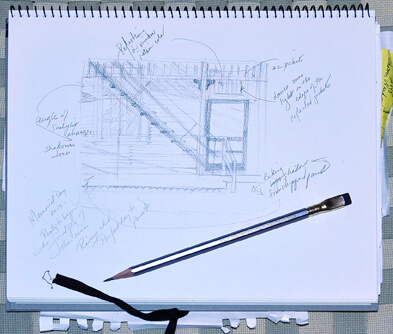
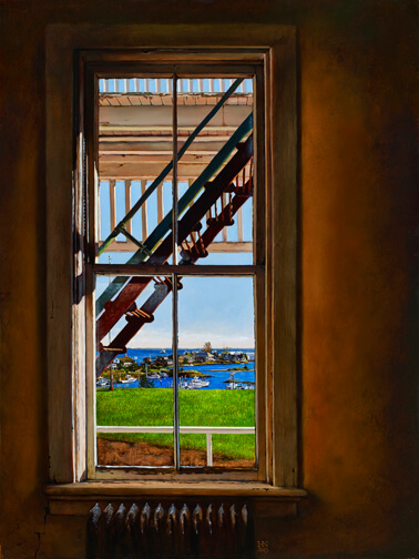
A sketch of this painting appears in the catalogue that we made for this series. Here’s a peak…
It’s always fun to look back and see how closely I come to the initial ideas for a composition. In this case what I seemed to have been most focused on was the quality of those raking shadows across the clapboard. The colors and intensity within varied wildly from one side of the wall to the other and the colors of the fire escape bounced back up to influence them further. And the title, which came to me in part because I started the sketching on Memorial Day, and mostly because the colors and the lines somehow kept reminding me of those patriotic swags that drape over holiday porch railings.
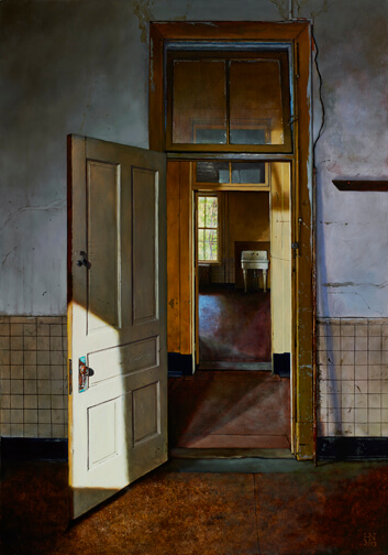
This was actually the last one I painted in the series. I was winding down after spending over 300 hours working on the big one, which you will see tomorrow, and was positively bleary eyed from all the tiny details. Once again, I realized that this last one had to embody all the lessons learned about peeling paint and rusting iron, how much wavy glass to leave in and leave out, how to stay true to the architecture and its weathering and mostly, how long it takes to build up a realistic portrait of over a hundred years of the life of a giant old building, that sits on top of a hill, on an island, off the coast of New England.
I had to revisit that porcelain sink
and the verdigris on the copper door handle
and the cool lavender light
framing the warm glow in the hallway
and the barest hint of a fire escape
and the sweet sharp elegance
of those hairline cracks in the plaster
but my favorite part of this painting
was discovering
upon very close inspection of my reference photos
the tiny thumbtacks used to hold some old strings in place
and the dearest little shadow
that was cast by the one
that I secretly tacked
onto the wooden peg rail…
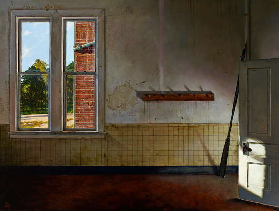
By the time I started this painting I was deep into the zone.
I had found the essence of the story I wanted to tell with this series
and was deeply committed to telling it honestly.
I had learned how the light could change the color of the walls in every room.
How the quality of that same light could alter the temperature of the shadows.
Yet I was still finding little surprises along the way.
Like how, in this room, on this October morning,
that light could tease itself in an obscure angle
in front of and behind the open door
and cast a theatrical raking light right back up the wall.
I wanted to play with that so I added the oar.
It lives here in my studio but the painting needed some middle ground
and so did the story being told.
It is meant to represent the Sailing Camp Days
and the now empty former hospital rooms
had few traces of happily playing children.
But the rainbows
filtering in at the edges
seem to echo their voices.
So too, would that oar return to play a roll in the final painting in this series,
but you’ll have to wait a bit longer for that reveal…
So, this is where it started to get real
I worked for several days
laying down layers of loose color
I knew it was the detail
the incredibly rich detail
of the stuccoed wall that was in play here
and it was great fun to build up the earthy colors
almost as if I had plastered it myself
and replastered
and repaired that replastering
but at some point
I think it was after I danced those dark lines of tin
underneath the peeling blue paint on the ceiling
I made the leap of faith
and committed to take those cracks
to a whole other level
and, as I mentioned in the catalogue,
that’s when I began to listen
on a much deeper level
to the stories the building
had to tell.
The view of those beautiful bricks framed by the tall pair of windows made me feel as if I was looking into a corner of some 18th century European city. Transported in that way, the warm earthy colors needed to become prominent and saturated to play off the contrasting cool blues in the tiles and the sink.
For most of the time it took me to paint this I was listening to The Magus, by John Fowles. Talk about contrasts. I was 18 when I took a course on that book in college. My friend Rex had insisted since it was being taught by his favorite professor, the poet William Meredith. A whole semester dwelling deep in the psychic depths of Fowles was intense to say the least and rereading it in my mid-fifties was a wild trip down that memory lane.
What shocked me the most was how incredibly naïve I was at the time of the first reading. Learned interpretive teachings aside, I couldn’t have had a clue what was really going on in that story. Not that I pretend to understand it much better now, but the decades and layers of life lessons in between made it feel like I have grown a heavy rain sodden wool coat of flesh over that tender young college student.
The patina on the outer surfaces of this building is like that coat.
Hard traveled…and well earned.
I am in love with these fire escapes.
They were originally painted red and green…
or maybe that’s wrong,
maybe the red is from the rusting over the years.
Either way they sport those colors now
and, when the morning light rakes across the lagoon,
they just sing against the whitewashed clapboard outside.
This was my first attempt at painting the buildings
and boats in the harbor and I got very familiar
with my magnifying glass.
It was a challenge to decide how much distortion
to render from the old rippling window glass.
I left just a little in because I wanted to see
the lines on the rigging and the deck on the ferry.
This is also the only view of the harbor
where I left the telephone poles in.
Artistic license is my super power.
This was the second painting I worked on in the series
and the first where I had just the architecture to focus on.
Every single surface was reflecting the sunlight differently.
I really had to learn the founding structure of the building
and came to appreciate my limited knowledge of construction
as I studied the sketches and reference photos
in great detail to make sure I got them accurate.
Once I had the bones down
it was all about the light.
And letting it dance around on the walls
and reflect off of the banisters
and drive that shaft straight into the foreground
and bounce back
in that impossibly blue line
just behind the door.